Data Munging and Visualization Guidelines
There are a couple principles of data design that I think we should be aligned on.
Wrangling Data into Tidy Format
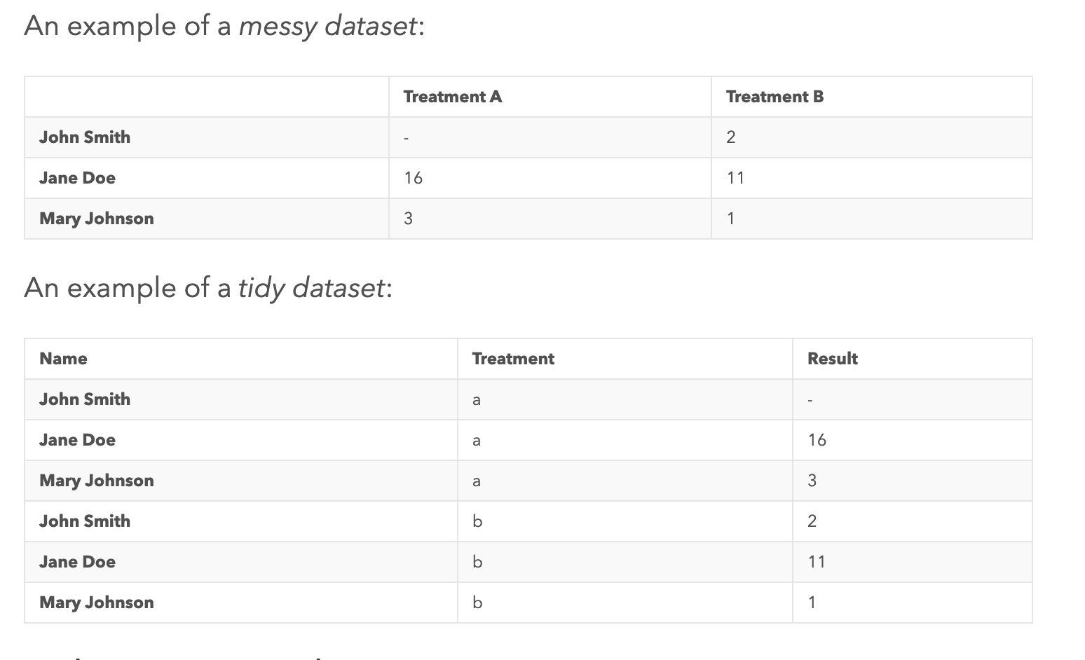
We’re ingesting a variety of data, in various formats, frequencies, types, etc. How do we structure this data into a format that is most easily understood by everyone in the team? A principle I try to maintain are the tidydata guidelines that Hadley Wickham has proposed.
In brief, tidy data is data that is
- Each observation is a row
- Each variable forms a column and holds values
- Each type of observational unit forms a table
We wrangle data to go from messy → tidy.

https://www.jeannicholashould.com/tidy-data-in-python.html